Case - Daniels Pengetips
Et website genopbygget til at matche autoriteten bag det
- Website & Brand
- Fuld redesign
- Webdesign
- Konvertering
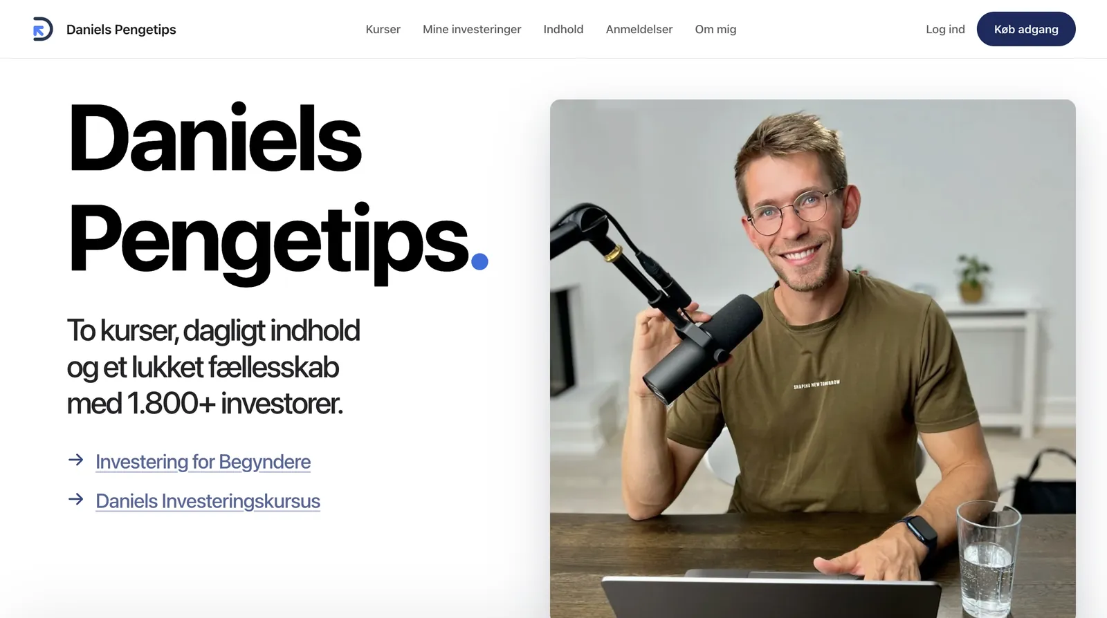
Publikummet var der. Sitet matchede det ikke.
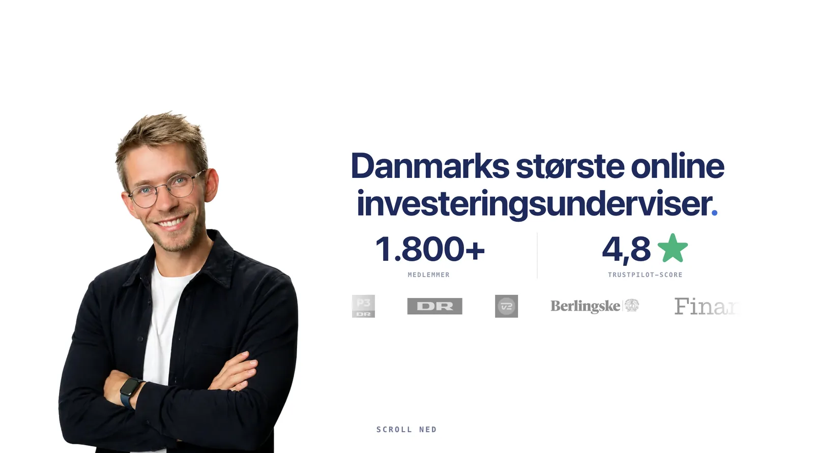
Daniel havde allerede autoriteten - 140.000 følgere på tværs af sociale medier, 1.800+ medlemmer og omtale i DR, P3, TV2, Berlingske og Finans. Kurserne kørte, medlemsplatformen kørte, forretningen fungerede.
Det, der ikke matchede, var det offentlige website. Det var det første, en ny besøgende mødte, og det bar hverken vægten af brandet bag det eller arbejdede hårdt nok for at gøre seere til købere.
Hver offentlig side redesignet fra bunden
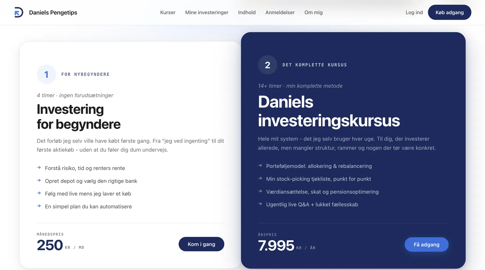
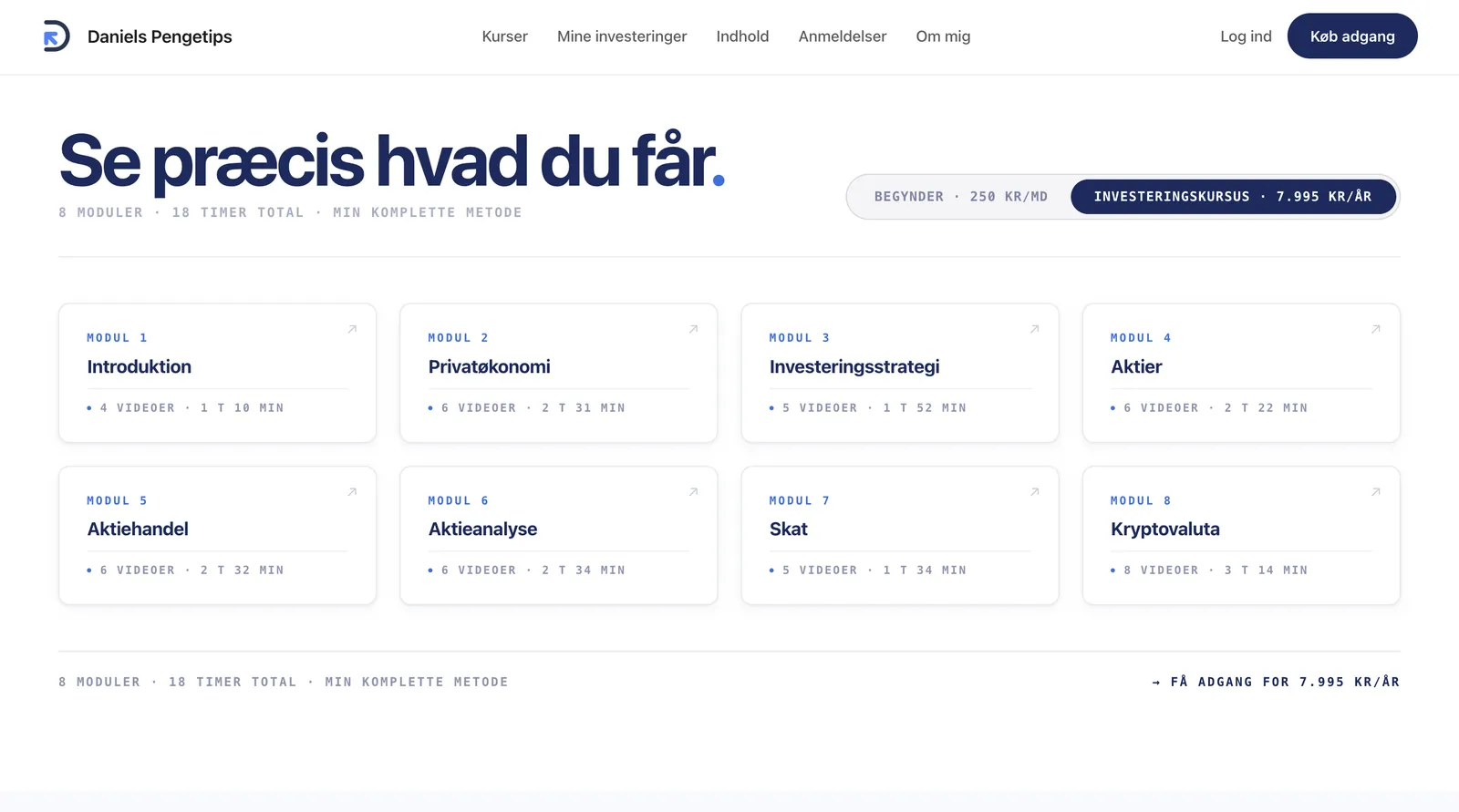
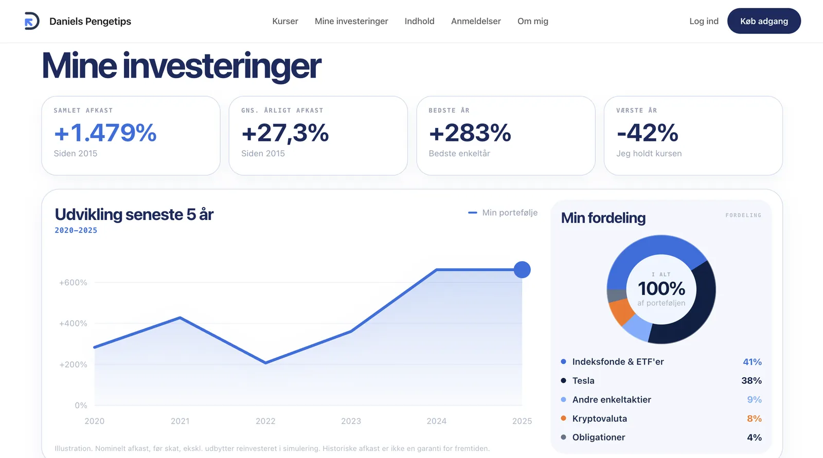
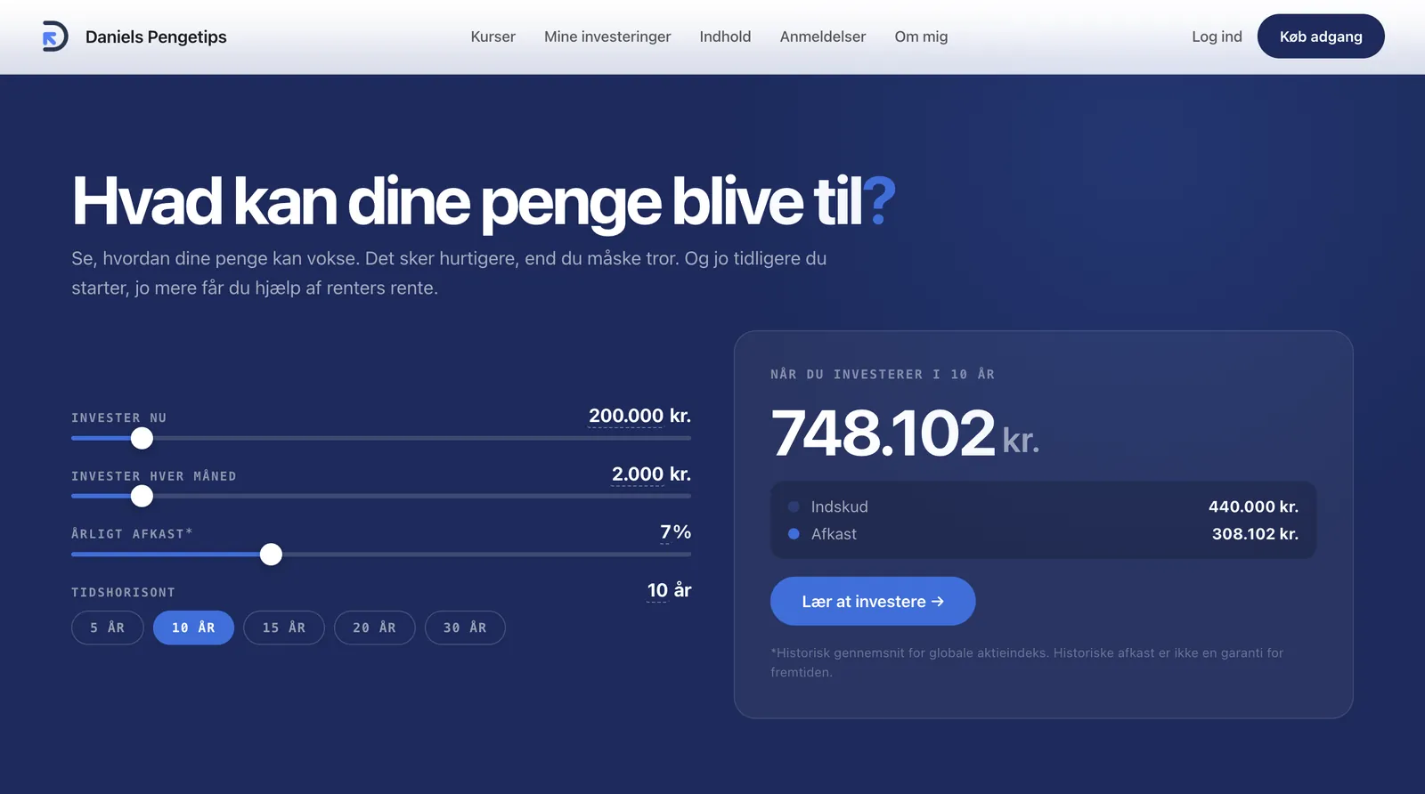
Intet blev overført fra det gamle site. Hver side foran login blev tegnet fra bunden: forsiden, kursussiderne, modul-oversigten, porteføljesiden, "om mig"-siden, rentes rente-beregneren og indgangen til den gratis undervisning.
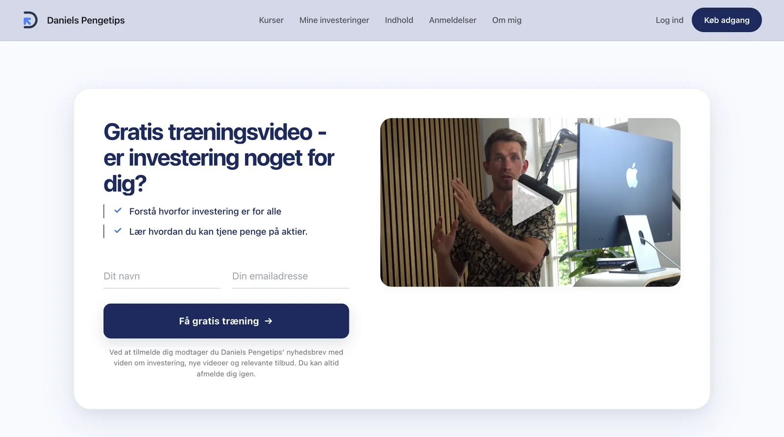
To ting gik igen i det hele. Sitet skulle se ud, som om det hører til Danmarks største online investeringsunderviser - og hver side skulle gøre et stykke arbejde på vejen mod en beslutning. Niveau, indhold og pris synligt fra første sekund. Beviser placeret der, hvor tvivlen opstår. Et lavfriktions-indgangspunkt, før nogen bliver bedt om at betale.
En hoveddør, der bærer brandet
Det offentlige website læses nu på samme niveau som kanalen bag det - ét visuelt sprog på tværs af hver side, en besøgende møder, før de køber.
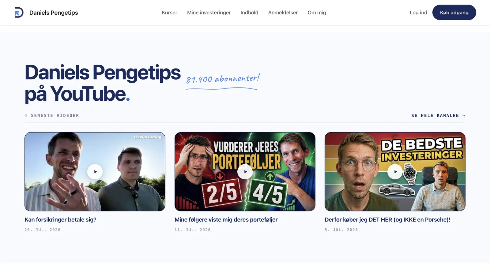
Trustpilot-score, medlemstal, presseomtale og YouTube-kanalen er samlet der, hvor de gør mest gavn, så beviserne taler for sig selv uden et ord for meget.
Rundt om sitet
Se alt arbejde